The psychology of colour is one of the most debatable aspects in visual marketing. There are many elements that influence how people react to colour. Personal preference, past experience and cultural differences are some examples that can influence people’s responses to colour. The most important question when it comes to choosing a corporate colour or colours for your Real Estate Brand is does it evoke the right emotional response across the broadest segment of your target market?
Here is some general guides on what emotional responses can be expected from basic colour families;
Red evokes a sense of passion and is exciting and powerful. Orange is vibrant, friendly and inviting. Yellow grabs attention, is energising and creates a sense of happiness. Green has a calming effect, is stable and creates a sense of trust and possibility. Blue represents trust and status. Purple is creative, imaginative and is often used to communicate wealth and prosperity. Black represents power, trust and status.
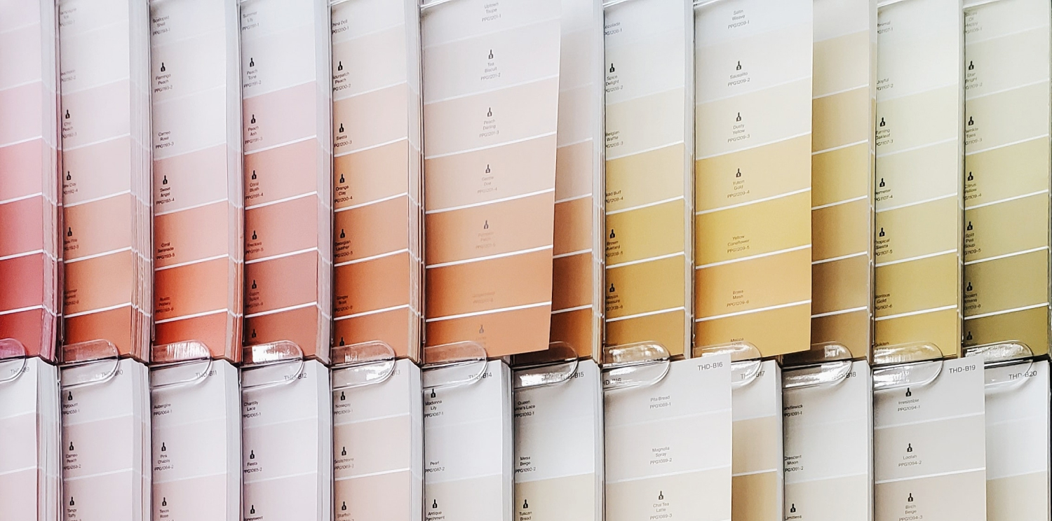
Once you have chosen your corporate colour swatch, it is important to ensure that it is correctly reproduced. Shades, tints and hues within colour plays an integral part in the desired emotional response, so getting it wrong in the printing process can be disastrous.
Ensure that you choose your colour swatch from the Pantone Colour Guide. This universal guide ensures that you always have a reliable source to compare colour to. Most printing is done by mixing Cyan, Magenta, Yellow and Black to achieve the desired colour. Getting your corporate colour correct relies heavily on your printer. Supplying them with a Pantone Colour Code will ensure that they can match it perfectly. Printing your corporate colour with the actual Pantone ink is even safer. Similarly reproducing your colour on the web can be as tricky. Colour is reproduced on digital media by mixing Red, Green and Blue light together. The best advice to ensure that your Real Estate Brand’s colour remains consistent across all media is to employ a colour specialist to visually match your printing and digital colour. In some cases it might even involve manually tweaking the CMYK and RGB percentages to ensure consistency.
Aligning your Real Estate Brand with a particular colour is as important as ensuring that your logo represents who you are and what your values are. Take your time, research what colour will work best for your brand and do not let your personal perception affect your choice.